)
U-Plotter Documentation
Overview
The UNAVCO U-Plotter is a tool to enable users to visualize many of the time series data sets available through UNAVCO web services. In the future, we may add the ability to plot external data sets as well.
It is intended to be easy to use for a novice user, yet offer powerful options for the more experienced user.
If you have questions or suggestions, please email u-plotter![]() unavco.org
unavco.org
Creating Your First Plot
Open the U-Plotter
Open up the UNAVCO U-Plotter in a new window.
Choose a plot type
You should see a page with content similar to this:
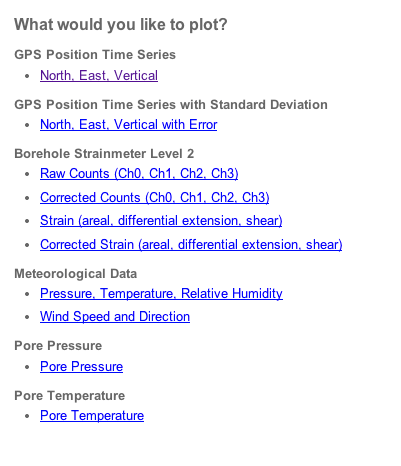
For each data type (e.g. GPS Position Time Series or Pore Pressure), there are one or more pre-defined plots (e.g. North, East, Vertical). These pre-defined plots are intended to be a good starting place for viewing UNAVCO time series data. For example, the North, East, Vertical plot will create three charts and put one dimension in each chart. This is a very common way of looking at GPS time series data.
The pre-defined plots may be good enough for most users, but you will have the option of adding more data sets later.
Please click the North, East, Vertical link to continue.
Choose plot parameters
You should now see a page similar to this:
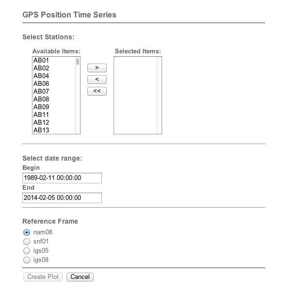
Select Stations
You can choose to plot data from one or several stations. There are several ways to do this:
- Double-clicking station names in the Available Items box will move them to the Selected Items box. Conversely, double-clicking stations in the Selected Items box will move them back to the Available Items box.
- Select an item in the Available Items box and press the > button.
- Select multiple items by holding shift while clicking to select a range or by pressing ctrl or command while clicking.
In many browsers, you can quickly move around the list by clicking on any station and then typing in the first letter of the station of interest. Some browsers will allow you to type the whole station code to jump immediately to one station.
It is important to note that more stations will require more data downloaded to your browser. This will both increase the amount of time it takes to produce a plot and decrease performance. Be cautious about adding too many stations.
Double click on one or two stations to plot them.
Select date range
Choose a begin and end date that you want to plot. You will get a warning if you select a time range that may be too large. Very large ranges, especially with high rate data (~1Hz), can either timeout and produce no plot at all or can produce a poor performing plot.
Choose a date range by typing in the dates or leave the default.
Additional options
Some data types will require other options. For example, the gps time series requires an option to select the reference frame. We have tried to make the default option align with the most commonly selected data, so if you aren't sure what to choose, try sticking with the default.
After you have chosen your stations and input valid dates (or left the default), you are ready to create your plot. Click the Create Plot button.
You should now have a plot! Congratulations!
Terminology
Before we step into modifying a plot, it is important to understand the terminology involved in our plots. First, a picture of a completed plot:

- A plot is the entire object shown in the above image. There will only be one plot on a page.
- A chart is one horizontal axis, one or more vertical axes, a title, and a legend. In the plot above, there are three charts with the titles North (mm), East (mm), and Vertical (mm).
- A series is one set of time, value pairs from one data set. In this plot, there are two series per chart, one for AB01 (blue) and one for AB06 (green). Read more about series below.
- While we can't directly visualize them, this plot has two data sets, one for AB01 from 1989-02-11T00:00:00 to 2014-02-05T00:00:00, using the nam08 reference frame and a similar one for AB06. A data set is a set of csv-formatted data which contains one date column and one or more data columns. Together, a date column and a data column make a series, not all of which are always plotted by default. For example, the GPS time series data sets also include Standard Deviation series, which can be added manually.
Currently, all of our data sets are retrieved from the UNAVCO web services. In the future, we may expand this to include time series from other sources.
Using The Plot
Read data values
If you hover your cursor over a chart, you can find the value for each series at a specific date. The value will appear next to the legend entry for the series and the date will appear at the top of the axis. In addition, a vertical line will appear under the cursor and the specific points will be highlighted in each series. All charts in the plot will show the values for the same date.

In this chart, AB01 North (mm) has a value of 4.01 on September 28, 2012 at 00:00:00. AB06 North (mm) has a value of -4.97.
Zoom in and out
There are several ways to zoom in and out. Note that this is a plot-wide setting. All of the charts in a plot will always have the same values on the time (horizontal) axis.
Range Picker

Type dates directly into the range picker to precisely choose start and end dates.
Zoom Panel

Click on a button in the zoom panel to zoom to the preset levels, from 1 day to the maximum time span.
Scroller

The scroller has several functions:
- Click and drag on the handles to increase or decrease the start or end date.
- Click and drag on the shaded area to move the time span, keeping the overall duration constant.
You can also click and drag directly on a chart to move the time span, as long as you are not currently showing the entire time span.
Editing a Plot: Chart, Axis, and Series Settings
Overview

Click on the menu to open up the Chart, Axis, and Series Settings.
In this menu, you will be able to manipulate the charts by adding or removing series, axes, and charts, as well as adjusting titles and colors.
Charts

When you open the menu, you will see a list of charts that are currently in your plot. In this case, there are three charts, each of which has a submenu.
The Create New Chart button will create a new, blank chart at the bottom of the plot. The plot is constrained in size, so adding a new chart will make all of the charts shorter.
Chart Submenu

Click on the chart name to open the chart submenu. This menu contains settings related to a specific chart in the plot.
The Enabled checkbox can be used to quickly enable or disable the chart. All of the settings are retained when the chart is disabled, but it will no longer be visible on the plot. If you think you will use the chart in the future, it is better to disable it than to delete it.
The Title: input is used to change the title of the chart.
The Series Settings submenu is described below.
The Axis submenus are also described below.
The Add Axis button will add additional vertical axes to the chart. This is useful if you want to have two series with very different value ranges in the same chart. You can assign the series to different vertical axes from the series submenus. A new axis will not be visible on the chart until a series is assigned to it.
The Delete Chart button permanently deletes the chart.
Series Settings

There will be one series submenu for each series in the chart.
Additionally, there is a submenu to Add Series To Chart.

Click on the series name to add it to the chart. You can click on as many as you would like. You can even add the same series to the chart multiple times.
You can add more series to this list by adding data sets in the data settings section.
# Series Submenu

This area is for changing settings for one series in one chart.
The Enabled checkbox can be used to quickly enable or disable the series. All of the settings are retained when the series is disabled, but it will no longer be visible on the chart.
The Name input can be used to change the name both in the header of this menu and, more importantly, in the legend of the chart. If a chart has many series, it will be necessary to shorten the names of the series to fit them in the legend area.
The Color widget can be used to adjust the color of the series. The color will not change until the choose button is pressed.
The Series Type dropdown can be used to change the series type. The types available depend on the data source. Most series will be able to use lines, splines, bars, markers, etc., but GPS Time Series Error, which is a range series, has RangeArea, RangeBar, and RangeSplineArea available.
Depending on the series type, there may be an input for Line Thickness. This changes the thickness of the series in the chart. Increase the thickness to make the series bolder, possibly at the expense of clarity.
If there is more than one axis in the chart, there will be a dropdown here to choose the Axis. Select an axis by name to assign this series to that axis.
# Axis Submenu

One of these menus will be available for each axis in this chart.
The Enabled checkbox can be used to hide or show the axis.
The Maximum Mode and Minimum Mode dropdowns are used to configure how the maximum and minimum of the axis is calculated. They both have the same three options, but can be configured independently:
- Auto By Visible Range: set the max or min to best fit all the visible data.
- Auto By All Range: set the max or min to best fit all of the data, even data not currently visible.
- Custom Value: When this option is selected, an input box will appear. You can put any numeric value in this input.
The Position dropdown allows the user to select if the axis should be on the left side or the right side of the chart.
The Offset input box allows the user to move the position of the axis. This is especially useful when there are multiple vertical axes on the same side of the chart.
The Type dropdown allows selection of Linear or Logarithmic scales. If logarithmic is chosen, two additional controls appear:
- Log Base: any number for the base of the logarithm (default 10)
- Log Negative Mode: choose how to handle negative values in the logarithmic axis.
Comparison Mode is a powerful feature which allows the user to visualize changes in the data. There are three options:
- Values: just display the values. This is the default.
- Changes: display the change in the series over time, instead of the value of the series.
- Percent Changes: similar to Changes, but the axis displays percent change instead of values.
If either Changes or Percent Changes is selected, an additional dropdown will appear. Calculate Comparison Changes From allows the user to choose if the Changes or Percent Changes should be calculated from the first visible data point or from the first point in the series.
Every axis except for the Primary Axis, will also have a Delete Axis button. This will permanently remove the axis.
Editing a Plot: Data Settings

The data settings menu allows the user to add data sets or modify existing data sets by changing the start and end dates. After making any changes in this section, all data must be reloaded. This can be accomplished by using the Apply Changes button or it will be done automatically if any change is made to other plot settings after a data setting change.
Adding a data set will not alter the appearance of the plot. It will, however, allow the user to add new series to charts. The software figures out the series that the data set provides and makes these available for adding under the Add Series submenu. This submenu can be found under Series Settings for each Chart in the Chart, Axis, and Series Settings menu.
Re-window Data Sets

This submenu allows the user to modify the begin and end date of existing data sets. Type in the new begin and/or end dates and then press the Apply Changes button.
Load New Data Set

This submenu allows the user to add a new data set. The workflow here is very similar to the initial creation of the plot. However, in this case, we can only choose a data type (e.g. GPS Position Time Series), not a specific presentation of the data (e.g. North, East, Vertical).
The begin and end dates are filled in automatically with whatever begin and end dates were last chosen. If you are choosing a different data type, this range may not be appropriate and you may see a warning about selecting too much data. Please narrow down the date range to be less than the maximum recommended duration.
After adding a data set, all data must be reloaded. This can be done by pressing the Apply Changes button or it will be done automatically if some other setting is changed.
Again, adding a data set will not alter the plot at all. However, the user may add the new series to a chart from within the chart submenu.
Editing a Plot: Event Markers

This menu allows the user to add and edit Event Markers. Event Markers are discrete events that are associated with a series. They will appear as flags either on the series itself (by default) or on the horizontal axis.
Adding Maintenance Events
Click the Add Markers button and then click on the Maintenance link.
You should now see something like this:

The Station dropdown list will have a list of all the stations currently in the plot. You can either select a station from this list or input a different station four-character code in the input box below. No checking is done by our software to ensure that this code is valid, so please make sure that it is a valid station code.
The Begin and End input boxes work just like the date input boxes used to create the plot.
Once you have selected a station and are satisfied with the dates, press Continue, to choose a series.

The event markers must be associated with a particular series. In this menu is a list of all the series names, ordered by chart. Click on a series to associate the markers with this series. The event markers will appear in the same chart as the series you have selected, but they will be on the axis by default.

Adding Earthquake Events
Click the Add Markers Button followed by the Earthquakes link.
This will produce a menu that looks like this:

The Station and Dates options work the same here as in the maintenance markers section. However, the meaning of the station is subtly different. For maintenance event markers, we produce markers for events that happened at that station. For earthquake event markers, we produce markers for earthquakes near that station.
The Minimum Magnitude input allows the user to filter out earthquakes below a certain magnitude. Try to keep this as large as possible to not overwhelm the chart with markers.
The Max Radius (deg) input allows the user to filter out earthquakes greater than a certain radius (in degrees) away from the station. Keep this as low as possible to reduce the number of earthquake event markers.
After selecting a station, dates, minimum magnitude, and radius, press Continue to associate the event markers with a series. Again, this works in the same manner as adding a maintenance event.
Editing Markers
Once you have added markers to your plot, you will be able to edit them from within the Event Markers menu. In this example, we have added Maintenance Event Markers for station AB01.

Open the AB01 Maintenance menu to see the options for editing these markers.

The Visible toggle enables and disables the markers.
The Format input allows you to change the letter on the event markers. For best results, this should only be one letter long.
The Position dropdown has four options:
- Axis: the markers are placed on the horizontal axis
- Series: the markers are placed on the series
- SeriesPositive: the markers are placed on the series, unless the series value is negative, then it will be placed at zero.
- SeriesNegative: the markers are placed on the series, unless the series value is positive, then it will be placed at zero.
The Move to a different series submenu allows the user to associate the events with a different series. It is very similar to the last portion of event marker creation.
The Delete Marker Group button permanently removes these event markers from the plot.
Editing a Plot: General Settings

This menu allows the user to modify a few things that affect the entire plot.
The Title input allows the user to change the title, which appears at the top of the plot.
The Background color selector allows the user to choose a different color for the background of the plot.
The Group Data checkbox changes the way series are plotted. Instead of plotting every point, a number of consecutive points are grouped together to limit the total number of visible points to be Max Visible Points (which is visible if Group Data is checked). In most cases, the grouped points are averaged together to calculate the grouped value. However, for wind direction, we use the value of the last point in the group, since a wind direction average is not very useful.
Grouping data can make the data loading process a bit faster, but it can reduce scrolling performance.
Exporting
Export the plot

Right click on the plot to see the context menu. There are several options for exporting the plot.
Export the data
Under the plot, there is a link called Show data sources. Clicking this will display the list of data sources used in the plot with links to the web service that provided the data. Note, however, that using web services often requires setting a header to get data in a certain format, such as json or csv.
Start Over

If you wish to create a new plot from scratch, it is best to press the Start Over button, followed by the Yes button to confirm.
Last modified: 2019-12-24 02:29:40 America/Denver